Dialogues of Light – Jorge Arévalo illustrates the relationship between light and those who shape it

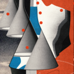
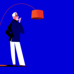
For What’s in a Lamp?, Spanish illustrator and art director Jorge Arévalo portrays Foscarini’s lamps and designers with his unmistakable style: essential lines, bold colours, and graphic elegance. A suspended dialogue between the object of design and the mind that imagines it.
An internationally renowned illustrator, Jorge Arévalo lives and works in Madrid, dividing his time between creative direction and drawing. After his beginnings in advertising agencies, he brought his distinctive line to publications such as The New Yorker, Vanity Fair, and Rolling Stone. His synthetic and vibrant figures are made of few strokes, yet they convey rhythm, elegance, and character. “I try to define a character with the smallest amount of information possible,” he explains, “turning minimalism into fluid lines, into a gesture that brings rhythm and style.”
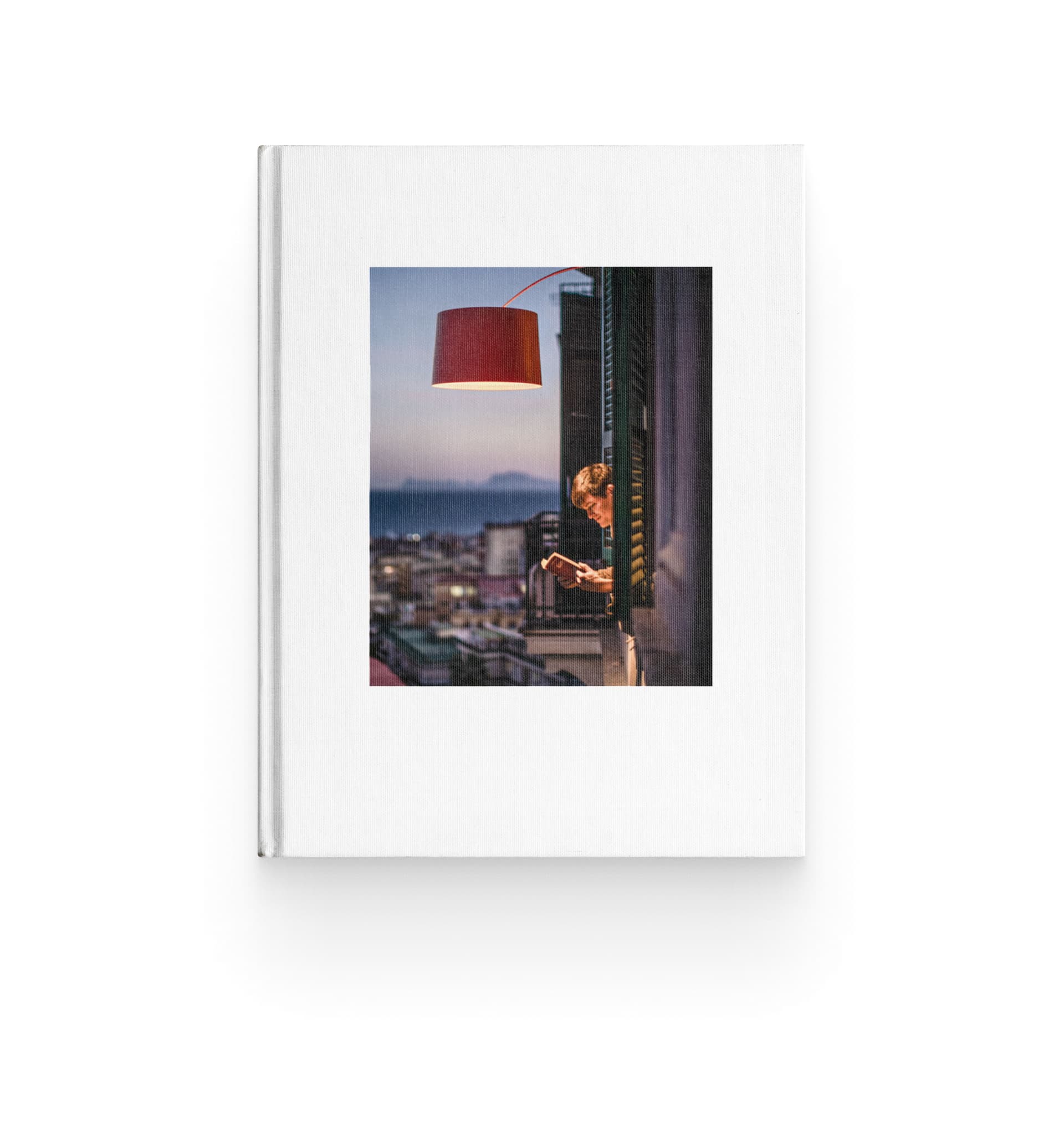
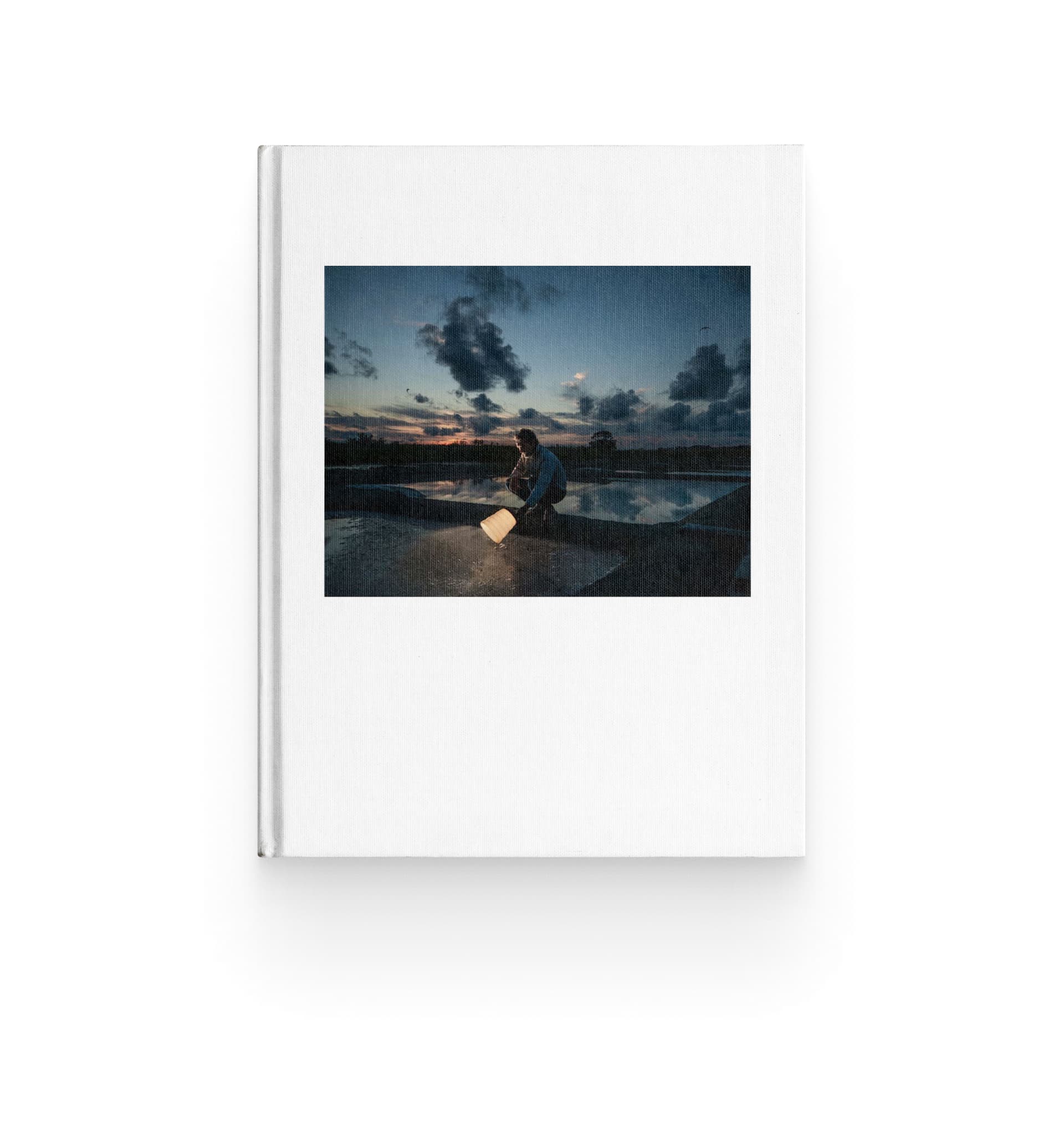
In his work for What’s in a Lamp? – the editorial project through which Foscarini invites artists and creatives from different disciplines – illustrators, photographers, sculptors, animators – to reinterpret its lamps from a personal and free perspective – Arévalo stages a dialogue between designers and the lamps they have created.
On one side, the great masters – Rodolfo Dordoni with Lumiere, Ferruccio Laviani with Orbital, Patricia Urquiola and Eliana Gerotto with Caboche, and Marc Sadler with Twiggy – figures who have shaped the history of design and created some of the most iconic pieces in the Foscarini collection. On the other, two emerging voices in contemporary design – Felicia Arvid with Pli and Francesca Lanzavecchia with Allumette – bring a fresh, vital, and experimental outlook that opens up to the future.
After his project Chairs & Architects, Arévalo lifts his gaze upwards: light becomes the true protagonist, and the lamps turn into symbols of aspiration and desire – luminous presences that reflect their creators.
“Lamps fascinate me. The light of a lamp in a home defines us more than a chair. In this series, everything is more ethereal: the object of desire is high above, almost within reach of the fingertips.”
Jorge Arévalo
/ Artist
Each illustration combines graphic precision with narrative sensitivity. The colours – oranges, magentas, and turquoises, intensified by black – bring brightness and visual strength, while the relationship between lamp and designer always carries a human and intimate tone. The result is a gallery of essential and dynamic portraits, where the line becomes light, and light becomes story.
Where does your interest in drawing come from, and when did you realize it could become your professional path?
I have always drawn. As a child, if I wasn’t playing football, I was drawing. But it was only when I started working in an agency as an art director that I began to integrate illustration into my design projects. From there, a language was born – a style that was soon noticed and began to be requested by magazines and newspapers.
You define yourself as an “illustrator” rather than an “artist.” Why is that distinction so important to you?
Illustration is an art, but it is not “art” in the pure sense of the word. I am an illustrator. The illustrator aims his arrow at a target and must hit it; the artist, on the other hand, places the target where the arrow falls. We illustrators work for a client, for a brand, with a briefing. Being clear about that allows me to work more professionally, while also giving me full freedom in my personal projects.
Is there a common thread between Jorge the creative director and Jorge the illustrator, or do you prefer to keep these two sides separate?
They are inseparable. One feeds the other, enriches it, expands it. Illustration exists only within a graphic context: a drawing on paper, on its own, is just a drawing, not an illustration. You need to visualize the atmosphere, the context, the story around it. I think that’s what really defines my style.
How would you describe your signature style in a few words?
I try to reach the essence of a character with as little information as possible. That minimalism, however, must turn into movement, rhythm, and a natural elegance of line.
Which have been your main cultural or artistic influences?
The illustration of the 1960s and cinema up to the 1980s. I always look to the classics: René Gruau, Miroslav Sasek, Al Hirschfeld, David Hockney… and further back, Mucha, Toulouse-Lautrec, Schiele, and even further, Velázquez, Goya, Caravaggio. All of them, in their own ways, have taught me how to build a figure and give it soul.
Can you tell us about your creative process, from the initial idea to the final illustration?
The key is to never start with a blank sheet. I always begin with a coloured background that helps me set the tone of the image. My work is digital, and that allows me to move elements with a designer’s mindset – as if composing a collage of shapes and proportions.
After Chairs & Architects, you approached Foscarini’s iconic lamps and their designers. What was the biggest challenge – or the main attraction – in this new parallel?
Lamps fascinate me. The light of a lamp in a home defines us more than a chair. In Chairs & Architects, the protagonists touched their chairs and looked downwards; in What’s in a Lamp?, everything is more ethereal. The object of desire is above, almost out of reach, and the light feels like something you could touch with your fingertips.
How much did you seek coherence across the series, and how much did you want each lamp to have its own unique identity?
I tried to maintain consistent proportions between the designer and the lamp, but I wanted it all to remain human. The designers had to feel comfortable next to their own creations – that was the real challenge.
Colour plays a central role in your work. How do you choose a palette? Is it more of an aesthetic choice or a language of meaning?
It depends on the project. Sometimes a series needs a coherent palette so that the concept remains dominant; other times, the character or the scene dictates the colours. In my work, black gives strength and structure to the illustration, enhancing the other colours. The tones that appear most often are orange, magenta, and turquoise – they are the colours that bring light.
And how did you approach colour specifically in this series for What’s in a Lamp??
I wanted powerful colours that would convey brightness. In this case, I gave priority to the object rather than the designer – it was the lamp that had to shine.
This series features four established designers and two emerging voices. Was it more challenging to reinterpret iconic designs already known to everyone, or to visualise new and evolving proposals?
Iconic designs already have a story, a past – it’s easier to capture their essence. New creations, on the other hand, are still evolving, changing, writing their own story, and that requires more improvisation.
Looking ahead, is there another type of design object you would like to reinterpret with this approach?
Cars.
Finally: what does creativity mean to you?
In my illustrations, creativity is when the viewer can look at the image and feel as if they are peeking through a window of Casa Malaparte or through the keyhole of a jazz club in Harlem.
Discover the full series by Jorge Arévalo for What’s in a Lamp? – the editorial project through which Foscarini invites artists and creatives to reinterpret lamps from a personal and free perspective – on Instagram @foscarinilamps.
