The shape of an idea: Peter Grundy interprets Foscarini for What’s in a Lamp?

With his unmistakable style defined by essential shapes and bold colors Peter Grundy transforms Foscarini lamps into visual archetypes of the concepts and values that define the brand’s identity for the editorial project What’s in a Lamp?. An exercise in synthesis and vision that invites us to see light not only as a source but as meaning itself.
Peter Grundy has built a career rooted in simplicity and is among the pioneers of conceptual infographics. From founding the studio Grundy & Northedge in 1980 to his more recent projects signed as Grundini, he has chosen to work more with information than advertising, dedicating himself to translating complex concepts into clear, accessible, and universal images. His graphic language is geometric and narrative, characterized by balance and reduction: a recognizable and distinctive visual code that serves the idea even before the image.
For What’s in a Lamp?, Grundy chose to tell Foscarini’s story through six lamps, six values, six visions: Lumiere speaks of internationality, openness and Foscarini design’s ability to engage with different cultures, each with its own way of experiencing light; Chouchin explores the meaning of home as a refuge and personal space; Buds embodies the spirit of avant-garde and the drive toward the future; Binic celebrates creative freedom; Satellight tells the story of the personality of luminous objects and how they connect emotionally with people; Kurage pays tribute to craftsmanship, the harmony between mind, hand, and material.


Six illustrations, each rising within the silhouette of a lamp, animated by a system of symbols and icons that visually translate each core value. Every image in this silent narrative cycle is a self-contained, dense, and eloquent system.
“My aim was to tell a story with each illustration that reflects Foscarini’s philosophy. The lamps are drawn in a very simple way, filled with iconography that represents the values and creates visual energy.”
PETER GRUNDY
/ ARTIST
There is something profoundly philosophical in the way Peter Grundy approaches form. His images, stripped down to the essentials, are like contemporary ideograms. In an age saturated with visual stimuli, Grundy reminds us that subtraction can be more radical than addition. And that a lamp is not just an object that lights: it can be a metaphor. Of identity, home, freedom. Of vision.
Follow Foscarini on Instagram to discover the full What’s in a Lamp? project and read the complete interview to dive deeper into Peter Grundy’s vision and artistic approach.

Can you briefly tell us about your journey? How did you end up doing what you do today?
In 1980, Tilly Northedge and I founded a studio to explore information design in a new, imaginative and personal way. First, because nobody else was doing it. Second, because while at the Royal College of Art two years earlier, we had grown interested in a kind of design that was more about explaining than selling.
Over the next 26 years, as Grundy & Northedge, we redefined what is now known as infographics.
As Graphis magazine once put it: “In the design world, the communication of information has never had the allure of more glamorous disciplines. Designing a poster can cast the designer as an artist, creating the identity of a multinational turns them into a strategist. But who designs maps for housing developments, or instructions for tying a bow tie?” That was us – Peter Grundy and Tilly Northedge.
In 2006, I founded Grundini to focus on smaller, creatively driven projects, often in collaboration with other designers and agencies. Former Scenario colleague Angela Wilkinson wrote: “Today Peter Grundy, aka Grundini, tackles modern messiness by designing simple, shared and accessible architectures of the future.”
Who were the key figures – designers, artists, illustrators – who shaped your visual and creative education?
Benno Zehnder, who taught me Swiss style while I was at the Bath Academy of Art 1973-1976.
Lou Klien, who introduced me to the American spirit when I went to the Royal College of Art 1976-1979.
You’ve often said that your style comes from necessity and simplicity. What does “visual economy” mean to you, and how central is it to your work today?
We created a drawing style in 1980 to convey our ideas that came from the geometric methods we had learned to design symbols, trademarks and letterforms. Over the years this style has developed, though the principle has always been the same: communicate ideas, simply and internationally, without the need for words.
Tell us about the concept behind your series for What’s in a Lamp?. What story did you want to tell, starting from the silhouettes of Foscarini’s iconic lamps?
I thought it would be interesting to tell a specific story for each lamp that would reflect Foscarini’s values. The themes we chose are: International, Home, Avant-Garde, Craftsmanship, Future and People.
Which of the values you chose to represent was the most challenging to translate into a visual language?
Avant-garde.


And which one resonated most with your own vision – the one that inspired you the most?
Avant-garde. What could be more fun than a vision of the future? My idea is a lamp that is a solar system, with Planet Earth in the center and the future orbiting around it.
You work with static images, yet they always seem to tell a story. What makes a strong visual narrative without movement or words?
The core of any design is an idea. The idea comes before any picture, symbol or animation. Some years ago I made a diagram to explain how I work: it shows an iceberg, with the tip being the picture, but the much larger part under the water that you don’t see is the idea.
How do you choose the symbols or icons when you turn complex ideas into images? Do you follow a clear method, or rely more on instinct?
I invent icons and symbols that tell a story effectively and elegantly, like someone would use a written language.
How do you approach color? Is it mainly about aesthetics, or do you use it as a language to convey meaning?
Colour plays two roles: first as a way of signposting, second as a way of making things beautiful. I choose colours instinctively. I often find that colours one would imagine as looking horrible together, like pink and orange or brown and grey, actually look great when used in the correct proportions. Something I learnt while working with architects.
Infographics were originally created to simplify. Do you still see them as a functional tool, or more as a form of art?
When I first started working in 1980, no one was doing infographics in a creative way. While at the Royal College of Art in the late ’70s we saw an opportunity. In those years most designers and illustrators were involved in advertising, brand and packaging — these were the glamorous areas of creativity. When Tilly Northedge and I founded Grundy & Northedge our aim was to do “Information” with the same creativity as advertising or corporate identity. We did so by using art and ideas to tell stories or explain complicated things.
What’s the most useful piece of advice you’ve received in your career? And what’s one that truly made you stop and reflect?
There’s only one thing worse than being bad, that’s being mediocre.
What does creativity mean to you?
Freedom to express individuality.
Learn more about the collaboration with Peter Grundy and the full series on the Instagram channel @foscarinilamps, and explore all the works from the project What’s in a Lamp?, where international artists are invited to interpret light and Foscarini lamps.

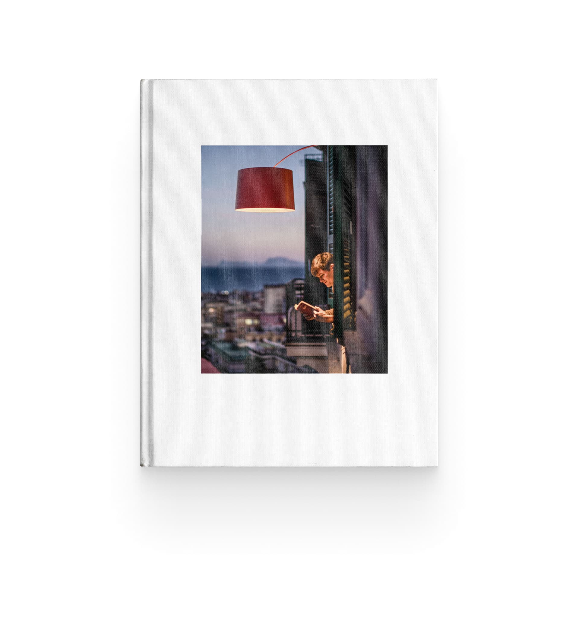
Under the light of Foscarini lamps, stories are born. These are the moments when light stops being decor and becomes Home.

For What’s in a Lamp?, Frelly builds a series of images in which each Foscarini lamp becomes a hat to be worn, turning design objects into living presences that reshape the space around the people who wear them.

Silent images, domestic settings, a light that sparks unexpected possibilities. For What’s in a Lamp?, Marianna Tomaselli creates a series of illustrations in which Foscarini lamps become the starting point of a visual narrative, where light generates relationships, atmospheres, and subtle shifts in meaning.

Illustratore, animatore e storyteller Brian Rea entra nell’universo di What’s in a lamp? trasformando le lampade Foscarini in presenze vive, intime e silenziose. Un progetto dove luce e personaggi dialogano con delicatezza, sorpresa e immaginazione.

A project by Massimo Gardone for Foscarini investigates the potential of artificial intelligence as a tool of expression, but always guided by a sensitive, conscious human touch. A story in which technology is a means of amplifying the human gaze, where settings generated by AI contain lamps photographed in their physical presence.

For What’s in a Lamp?, Spanish illustrator and art director Jorge Arévalo portrays Foscarini’s lamps and designers with his unmistakable style: essential lines, bold colours, and graphic elegance. A suspended dialogue between the object of design and the mind that imagines it.
For the What’s in a Lamp? project, Italian artist Beppe Conti imagines lamps not simply as sources of light, but as instruments that reveal the invisible. In his digital collages, fragments and hidden layers emerge from the darkness, shaped by the light of Foscarini lamps into dreamlike spaces.

Helen Musselwhite’s artistic universe is made of paper cutouts, folds, and shadows that narrate the wonder of the natural world. For What’s in a Lamp?, the artist reinterprets some of Foscarini’s lamps, transforming them into dreamlike paper landscapes.

After the interpretation of the luminator which led to the Chiaroscura lamp, Alberto and Francesco Meda rethink a lighting classic for Foscarini: the chandelier.

Francesca Lanzavecchia knows exactly what she wants: to design objects that never fail to make an impression. Not just a matter of aesthetics, but of that intense emotional resonance her projects attempt to set in motion. In an interview, she talks Allumette and Tilia, the two chandeliers she has designed for Foscarini.