Choose the country or territory you are in to see local content.

English

en

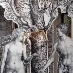
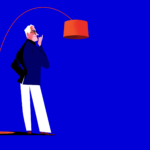
For What’s in a Lamp?, Spanish illustrator and art director Jorge Arévalo portrays Foscarini’s lamps and designers with his unmistakable style: essential lines, bold colours, and graphic elegance. A suspended dialogue between the object of design and the mind that imagines it.

An internationally renowned illustrator, Jorge Arévalo lives and works in Madrid, dividing his time between creative direction and drawing. After his beginnings in advertising agencies, he brought his distinctive line to publications such as The New Yorker, Vanity Fair, and Rolling Stone. His synthetic and vibrant figures are made of few strokes, yet they convey rhythm, elegance, and character. “I try to define a character with the smallest amount of information possible,” he explains, “turning minimalism into fluid lines, into a gesture that brings rhythm and style.”

In his work for What’s in a Lamp? – the editorial project through which Foscarini invites artists and creatives from different disciplines – illustrators, photographers, sculptors, animators – to reinterpret its lamps from a personal and free perspective – Arévalo stages a dialogue between designers and the lamps they have created.
On one side, the great masters – Rodolfo Dordoni with Lumiere, Ferruccio Laviani with Orbital, Patricia Urquiola and Eliana Gerotto with Caboche, and Marc Sadler with Twiggy – figures who have shaped the history of design and created some of the most iconic pieces in the Foscarini collection. On the other, two emerging voices in contemporary design – Felicia Arvid with Pli and Francesca Lanzavecchia with Allumette – bring a fresh, vital, and experimental outlook that opens up to the future.

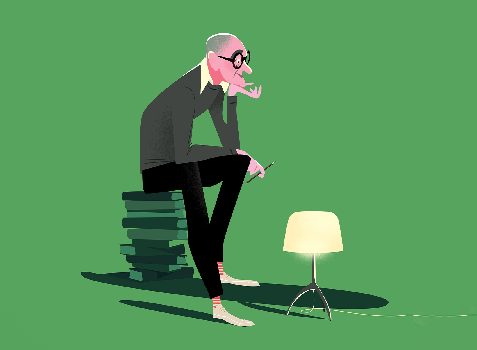
After his project Chairs & Architects, Arévalo lifts his gaze upwards: light becomes the true protagonist, and the lamps turn into symbols of aspiration and desire – luminous presences that reflect their creators.

“Lamps fascinate me. The light of a lamp in a home defines us more than a chair. In this series, everything is more ethereal: the object of desire is high above, almost within reach of the fingertips.”

Jorge Arévalo
/ Artist

Each illustration combines graphic precision with narrative sensitivity. The colours – oranges, magentas, and turquoises, intensified by black – bring brightness and visual strength, while the relationship between lamp and designer always carries a human and intimate tone. The result is a gallery of essential and dynamic portraits, where the line becomes light, and light becomes story.

Where does your interest in drawing come from, and when did you realize it could become your professional path?

I have always drawn. As a child, if I wasn’t playing football, I was drawing. But it was only when I started working in an agency as an art director that I began to integrate illustration into my design projects. From there, a language was born – a style that was soon noticed and began to be requested by magazines and newspapers.


You define yourself as an “illustrator” rather than an “artist.” Why is that distinction so important to you?

Illustration is an art, but it is not “art” in the pure sense of the word. I am an illustrator. The illustrator aims his arrow at a target and must hit it; the artist, on the other hand, places the target where the arrow falls. We illustrators work for a client, for a brand, with a briefing. Being clear about that allows me to work more professionally, while also giving me full freedom in my personal projects.


Is there a common thread between Jorge the creative director and Jorge the illustrator, or do you prefer to keep these two sides separate?

They are inseparable. One feeds the other, enriches it, expands it. Illustration exists only within a graphic context: a drawing on paper, on its own, is just a drawing, not an illustration. You need to visualize the atmosphere, the context, the story around it. I think that’s what really defines my style.


How would you describe your signature style in a few words?

I try to reach the essence of a character with as little information as possible. That minimalism, however, must turn into movement, rhythm, and a natural elegance of line.


Which have been your main cultural or artistic influences?

The illustration of the 1960s and cinema up to the 1980s. I always look to the classics: René Gruau, Miroslav Sasek, Al Hirschfeld, David Hockney… and further back, Mucha, Toulouse-Lautrec, Schiele, and even further, Velázquez, Goya, Caravaggio. All of them, in their own ways, have taught me how to build a figure and give it soul.


Can you tell us about your creative process, from the initial idea to the final illustration?

The key is to never start with a blank sheet. I always begin with a coloured background that helps me set the tone of the image. My work is digital, and that allows me to move elements with a designer’s mindset – as if composing a collage of shapes and proportions.


After Chairs & Architects, you approached Foscarini’s iconic lamps and their designers. What was the biggest challenge – or the main attraction – in this new parallel?

Lamps fascinate me. The light of a lamp in a home defines us more than a chair. In Chairs & Architects, the protagonists touched their chairs and looked downwards; in What’s in a Lamp?, everything is more ethereal. The object of desire is above, almost out of reach, and the light feels like something you could touch with your fingertips.


How much did you seek coherence across the series, and how much did you want each lamp to have its own unique identity?

I tried to maintain consistent proportions between the designer and the lamp, but I wanted it all to remain human. The designers had to feel comfortable next to their own creations – that was the real challenge.


Colour plays a central role in your work. How do you choose a palette? Is it more of an aesthetic choice or a language of meaning?

It depends on the project. Sometimes a series needs a coherent palette so that the concept remains dominant; other times, the character or the scene dictates the colours. In my work, black gives strength and structure to the illustration, enhancing the other colours. The tones that appear most often are orange, magenta, and turquoise – they are the colours that bring light.


And how did you approach colour specifically in this series for What’s in a Lamp??

I wanted powerful colours that would convey brightness. In this case, I gave priority to the object rather than the designer – it was the lamp that had to shine.


This series features four established designers and two emerging voices. Was it more challenging to reinterpret iconic designs already known to everyone, or to visualise new and evolving proposals?

Iconic designs already have a story, a past – it’s easier to capture their essence. New creations, on the other hand, are still evolving, changing, writing their own story, and that requires more improvisation.


Looking ahead, is there another type of design object you would like to reinterpret with this approach?

Cars.


Finally: what does creativity mean to you?

In my illustrations, creativity is when the viewer can look at the image and feel as if they are peeking through a window of Casa Malaparte or through the keyhole of a jazz club in Harlem.


Discover the full series by Jorge Arévalo for What’s in a Lamp? – the editorial project through which Foscarini invites artists and creatives to reinterpret lamps from a personal and free perspective – on Instagram @foscarinilamps.

What’s in a Lamp? on Instagram

The table lamps Chapeaux and Fleur, designed by the renowned Rodolfo Dordoni, have been selected for the ADI Design Index 2024. This recognition highlights the excellence of Foscarini’s design and marks the first step toward the Compasso d’Oro 2026.

The ADI Design Index is one of the most prestigious awards in the international design landscape, gathering the best industrial design projects each year. This year’s selection of 261 products inaugurates the biennial candidacy cycle for the Compasso d’Oro 2026. Among these are Chapeaux and Fleur, two table lamp designs by Rodolfo Dordoni that combine technological innovation, sophisticated aesthetics, and attention to functionality.

CHAPEAUX
Design: Rodolfo Dordoni
2023

Discover Chapeaux

With Chapeaux, the research started by Rodolfo Dordoni with Buds (a transparent base and a forceful diffuser) takes a new step forward, adding a new level of versatility that transforms the lamp’s character, the quality of the light, and its decorative impact.

The design elements of Chapeaux are reduced to the essentials. The conceptual core of the project consists of three diffusers: three different “hats” in different forms, materials and finishes—three in metal, two in glass, and one in porcelain. Open at the center, they rest on the transparent body of the lamp, made of borosilicate glass, which also sustains the light source: an ampoule with a touch-dimmer that houses the lighting components and seems to float inside the glass.

When the lamp is off, the transparent glass body almost vanishes from view, but it appears discreetly when the light is on, subtly conveying its substance. The choice of diffuser also dictates the quality of the light: the metal version, white on the inside, reflects the light onto the surface below, making it perfect for desktop lighting. The glass and porcelain “hats” offer a softer, ambient experience.

FLEUR
Design: Rodolfo Dordoni
2023

Discover Fleur

Fleur is a rechargeable table lamp with dual functions: the more natural one of illuminating and the unexpected one of containing water and a fresh flower. Like other lamps designed by Rodolfo Dordoni, Fleur is a project that speaks of opposites that meet, of solid and voids (real or perceived) that create unexpected harmonies. It is an erudite yet immediate stylistic exercise, with the lamp-object that defines the space around it: a setting that becomes  intimate, livable, enticing, personalized for any situation thanks to light.

Fleur is also highly functional. Thanks to a specially developed LED circuit, with miniaturized components, it lights the surface around its base and creates a broader light beam on the table compared to traditional battery-powered lamps. Fleur is energy-efficient too: it consumes only 1 watt, but has highly efficient LEDs—for rapid recharging via USB-C—which emit intense light, adjustable with a touch dimmer.

Fleur has been selected as the winner in the Most Illuminating Lighting category at the Wallpaper* Smart Space Awards, which highlight design projects that combine creativity, innovation, sustainability, simplicity, and style.

Scopri Fleur

The portable table lamp Fleur, designed by Rodolfo Dordoni, has won the Most Illuminating Lighting category at the 2024 Wallpaper* Smart Space Awards. Now in its fourth edition, this award celebrates excellence in home design, with a particular focus on creativity, innovation, sustainability, simplicity, and style.

The judges were impressed by Fleur’s ability to combine two distinct functions—the natural one of providing light and the unexpected one of holding fresh flowers—”with such style.” A design piece meeting the growing demand for flexibility, aesthetic appeal, and functionality.


Fleur’s design is a refined example of Dordoni’s mastery in creating objects that not only enhance a space with their aesthetic presence but also offer practicality and versatility. It’s a sophisticated yet accessible stylistic exercise, where the transparency and lightness of the glass base—designed to hold water and flowers—are elegantly paired with the refined colors of the lighting body, crafted to cast a broad beam of light across the surface.

Clean lines and high-quality materials define this portable table lamp, which combines poetry, functionality, and energy efficiency. It’s this fusion that impressed the judges, demonstrating how design can evolve to meet contemporary needs without sacrificing elegance.

E-BOOK

Fleur

Download the dedicated catalog to explore the design and features of the portable lamp Fleur, designed by Rodolfo Dordoni and awarded by Wallpaper*

The Permanent Design Observatory has once again chosen Foscarini for its design care and innovative character. Representing these distinctive qualities of the brand in 2023 are the lamps Nile and Chiaroscura, both selected in the Lighting Design category.

NILE
Table Lamp
Design: Rodolfo Dordoni


Conceived by Rodolfo Dordoni, Nile is a decorative lamp of remarkable character, with a vivid presence that brings sophisticated elegance to any space.  Beautiful even when off, it takes on even more allure when light filters through the precious blown glass, casting illumination both downward onto surfaces and upward through the two open sides of the diffuser.


A lamp-sculpture where contrasting elements coexist, unified in a composition of volumes seemingly defying gravity, symbolizing the balance between opposites: the solidity of marble and the delicacy of glass, the coldness of extracted material and the warmth of blown material. The base and diffuser, at different angles, remain in place thanks to an invisible game of weights, positions, and joints, resulting in a dynamic overall effect.

“I wanted a sculptural presence, a true diffuser of light, with a form that was not necessarily tied to the function. I designed two intersecting volumes: the small marble base and the large glass diffuser. When I looked at them, I was reminded of the famous bust of Queen Nefertiti, which gave me the name Nile.”

RODOLFO DORDONI
/ Designer

CHIAROSCURA
Floor Lamp
Design Alberto and Francesco Meda


Chiaroscura stems from a design challenge: to explore the possibility of enhancing the functionality of a classic luminator, which by definition only emits indirect up light. The elegant and lightweight body of Chiaroscura, which is totally illuminated rather than just illuminating,was the goal which led to the definition of the shape, the choice of materials and manufacturing technologies. Simultaneously understated yet packed with character, it is a discrete presence that masks a concealed technical complexity.


Chiaroscura is made up of three semi-arches which describe a specific triangular cross-section: a design choice that proves to be a balanced presence which thinks outside the box, because it is capable of changing depending on the perspective. The lamp consists of elements of different materials that slide into and interlock with each other, without sacrificing ease of assembly and disassembly. Its frame is an alternation of matt and luminous surfaces which lighten the visual impact of the lamp, made with extruded aluminium and PMMA in longitudinal prisms that concurrently ensure transparency and comfortable diffusion of light. Chiaroscura casts both a powerful indirect light, originating from the LED inserted at the top, as well as an indirect light on the wall or diffused into the room depending on how the lamp is adjusted, thanks to the LED strip housed inside along the full height of one of the extruded aluminium components. Integrated grooves allow sliding between aluminum and plastic, while side caps prevent undesired movements.

An immersive installation at Foscarini Spazio Monforte and a colorful and essential stand at Euroluce: two destinations at Milan Design Week to discover the new collections by Foscarini. New light ideas with a central focus on the brand’s design freedom driven by experimentation.

Long-term collaborations that move forward along with new partnerships, experimentation on shapes and materials, with a constant emphasis on the product and the expressive possibilities offered by various types of workmanship. During Milan Design Week 2023, Foscarini presents the new collections inside the updated framework of Euroluce (pav.11 – stand 106) and the FuoriSalone at Foscarini Spazio Monforte, with two installations created by Ferruccio Laviani.

/ (IM)POSSIBLE NATURES: a wild garden takes over Spazio Monforte

The installation (IM)POSSIBLE NATURES – designed by Ferruccio Laviani – is one of the go-to destinations of Milan Design Week 2023. An immersive installation where a natural world – made up of grass, herbs, and uncultivated plants – seems to have taken over. Visitors are invited to actively participate in the experience by getting carried away by imagination to an almost dreamlike context. In the middle the space: FREGIO, the new lamp designed by Andrea Anastasio. All around it: the greenery. An unexpected urban oasis within the frenzy of Milan Design Week. A space where human craftsmanship and the beauty of nature merge.

/ EUROLUCE 2023 — Hall 11 Stand 106

Euroluce 2023 will be very different from the previous ones, with a complete rethinking of the layout of the light fair based on a project by Lombardini 22. A loop-shaped plan will optimise routes taking into the pavillions elementsthat are typical of city spaces to foster the creation networks and community. An ideal city, enriched by interdisciplinary and experiential cultural content, exhibitions, talks, workshops and installations. Foscarini will present the product novelties in a stand designed by Ferruccio Laviani. Colorful, essential, functional: the layout is conceived to give full visibility and properly showcase each of the new models.

HALL 11 | STAND 106
18— 23 April 2023
H 9.30/18.30


Not only product: Foscarini participates in the schedule of cultural activities at Salone del Mobile 2023 with a special workshop that investigates light, Italian design and the craftsmanship behind the creation of some of the most beloved products in the collection.

Workshop | Shedding Light on Mastery
Exploring the Art and Craftsmanship of Foscarini

HALL 15 | Area Workshop
20 April 2023 H 16:00

/ PRODUCT NEWS

The narrative Foscarini conveys to its audience in the presentation of the new collections develops in three precise directions, all pertaining to the DNA of the company: the continuity of long-term collaborations with creatives and designers; the curiosity towards new languages and talents; and the research on materials aimed to solve project challenges and find new expressive possibilities.

Designed by Andrea Anastasio in collaboration with Bottega Gatti, FREGIO represents Foscarini’s attitude towards exploring new expressive languages in lighting design, also approaching different materials. Made of a section of a ceramic floral bas-relief, the lamp is presented as suspension and wall lamp offering light directed both downwards and upwards.

Rodolfo Dordoni presents two new projects of table lamps.

CHAPEAUX, A family of table lamps with three different diffusers of different shapes and materials (metal, blown glass, porcelain) that seem to float in the void sustained by a transparent pyrex base (image below).

And FLEUR a battery-powered wireless lamp that combines decoration and functionality: it illuminates but is also a small vase where you can put some water and a fresh flower.

Ludovica+Roberto Palomba continue their research on blown glass presenting HOBA, an organic-shaped family of lamps, asymmetric and irregular.

Foscarini also confirms its talent-scouting attitude, presenting PLI: a lamp designed by the young Danish designer Felicia Arvid, making her debut in the world of lighting.

And finally, the architects Oscar and Gabriele Buratti present ANOOR a wall and ceiling solution with a high emotional impact which plays with the two souls – technical and decorative – of light. An answer for all architects and interior designers who are looking for solutions that are at the same time decorative and functional.

A highly diversified package of novelties because each new Foscarini lamp is the result of a collaborative project that is built together, through dialogue and exchange, taking time. Giving oneself the pleasure of a process that does not disdain but welcomes error, reconsideration, and putting oneself back into play, with the goal of bringing distinctive design objects with character and meaning to the public, decorative lamps capable of transforming space, even when turned off.

At 2022 Milan Design Week Foscarini Spazio Monforte is transformed into a luxuriant Garden of Eden where new lights are revealed as objects of desire

As part of Fuori Salone 2022 Foscarini’s new products for 2022 are revealed in a fascinating installation designed by Ferruccio Laviani that redesigns and transforms the upper floor of Foscarini Spazio Monforte into a garden of Eden. De-Light Garden – the evocative name chosen for the installation – is an immersive journey in a luxuriant garden where new lights are revealed as unprecedented objects of desire for design lovers: Tonda by Laviani himself and Bridge by Francesco Meda – are the latest innovations. In the words of the designer himself, De-Light Garden plays on the theme of temptation and desire by reinterpreting the scene of Adam and Eve intent on gathering the forbidden fruit:

“Delighting means giving pleasure that’s also visual and tactile. De-light is dedicated to the subtle thread that binds us all in the overwhelming urge to possess something and the temptation we feel in desiring it. And it is precisely the temptation and pleasure that light, in all its forms, gives us that inspired me for the installation at Foscarini Spazio Monforte. When you enter you’re surrounded by the Garden of Eden and you see, as if frozen in time, the scene of Adam and Eve intent on plucking the fruit from the tree of Good and Evil, in a setting that looks like it’s straight out of a Dürer engraving. With this setup I wanted to give the idea that ‘falling into temptation’ every now and again is pleasant and that design and light also become an object of desire”.

FERRUCCIO LAVIANI
/ DESIGNER

The presentation of new products continues on the showroom’s lower floor with NILE by Rodolfo Dordoni and CHIAROSCURA by Alberto and Francesco Meda. These products, while very different and with their own identity, together confirm Foscarini’s consistently pioneering vision and its ability to constantly redefine the rules.

As further proof of Foscarini’s more experimental and innovative spirit, a great deal of space is dedicated to the research that the brand is conducting together with Andrea Anastasio on the theme of ceramics and interaction with light: Battiti.

In the project Battiti light is used not to illuminate but to construct. As if it were a material: it generates effects, underlines forms and invents shadows.

Learn more about Battiti.

It was in 1990 that Foscarini fi rst introduced its blown glass lamp, combined with an aluminium tripod, the result of a collaboration with designer Rodolfo Dordoni who reinterpreted the classic lamp shade in a new light. Its name? Lumiere.

Discover Lumiere

When and how did the Lumiere project begin (the spark, the people involved at the start)?

It began many years ago, so recalling all the people involved calls for an effort of memory that isn’t easy at my age, perhaps. I can tell you about the context, though. It was a period in which I had started working with Foscarini on a sort of corporate overhaul. They had called me in to coordinate things, which could mean a sort of art direction of the new collection, because they wanted to change the company’s approach.
Foscarini was a pseudo-Muranese business, in the sense that its home was Murano, but its mentality was not exclusively rooted there. We began to work on this concept: to conserve the company’s identity (that of its origins, therefore Murano and glass) while differentiating it from the attitudes of the other Murano-based fi rms (i.e. furnaces, blown glass), trying to add technological details to the product to give it character, making Foscarini into a “lighting” company, more than a producer of blown glass. This was the guiding concept for the Foscarini of the future, at the time.


Where was Lumiere invented? What led to its form-function (design constraints, the materials: blown glass and aluminium)?

Based on the guideline I have just described, we began to imagine and design products during our meetings. At one of those meetings – I think we were still in the old Murano headquarters – I made a sketch on a piece of paper, a very small drawing, it must have been about 2 x 4 cm: this glass hat with a tripod, just to convey the idea of combining glass and casting, because the casting of aluminium was a very contemporary, new idea at the time. So this little tripod with the casting and the glass wasn’t so much the design of a lamp as a drawing of a more general concept: “how to put together two elements that would represent the characteristics of the company’s future products”. In practice, that was the intuition.


One moment you remember more than others in the story of Lumiere (a conversation with the client, testing in the company, the first prototype)?

Well, definetely the moment when Alessandro Vecchiato and Carlo Urbinati showed interest in my sketch, in that intuition. I remember that Sandro took a look at the drawing and said: “That’s nice, we should make it”. The product was immediately glimpsed in that sketch. And I too thought the drawing could become a real product. So Lumiere was born.


We live in a society of rapid obsolescence. How does it feel to have designed a success that has continued for 25 years?

Those were truly diff erent times. When you designed something, the considerations of companies were also made in terms of investment, of its amortisation over time. So the things you designed were more extensively thought out. What has changed today is not the companies but the market, the attitude of the consumer, who has become more “mercurial”. Today’s consumer has been infl uenced by other merchandise sectors (i.e. fashion and technology) not to desire “lasting” things. So the expectations companies have regarding products are also defi nitely more short-term. When a product (like Lumiere) has such a long life in terms of sales, it means it is self-suffi cient, a product that wasn’t necessarily paying attention to trends, at the moment. That is precisely what makes it appealing, somehow. It brings pleasure, to the person who buys it and the person who designed it. Personally, I am pleased that Lumiere is a “sign” that is still recognizable, still has appeal: 25 years are a long time!


How has this context “made its mark” – if indeed it has – on the skin and mind of Rodolfo Dordoni, man and architect?

I think about two important moments that infl uenced my work. The fi rst is the encounter with Giulio Cappellini, who was my classmate at the university. After graduation, he asked me to work in his company. Thanks to this encounter I was able to learn about the world of design “from the inside”. I worked for 10 years, getting to know about all the aspects of the furniture sector. So my background is that of someone who knows, “in practice”, about the entire chain of design production. This led directly to the second of my important moments. Thanks to this practical experience, this work in the fi eld, when companies turn to me they know that they are not just asking for a product, but also for a line of reasoning. And often this reasoning leads to the construction of relationships with companies that become long discussions, long conversations, which help you to know the company. Knowing the company is a fundamental factor to analyse a project. I like to work – I’m a bit spoiled, in this sense – with people with whom I share similar intentions, similar goals to achieve. Then you have the possibility of growing together.


The Nineties:a Google search brings up the Spice Girls, Take That, Jovanotti with “È qui la festa?”, but also “Nevermind” by Nirvana and the track by Underworld in the soundtrack of the fi lm Trainspotting, “Born Slippy”. What comes to mind if you think about your experience of the Nineties?

For me the Nineties were the start of a progressive technological misunderstanding. Meaning that I started to no longer understand everything that happened from the vinyl LP onward, in music, technologically speaking. I often think back on how I criticized my father, when I was a kid, for being technologically backward. Compared to the way I am nowadays, his backwardness was nothing, if I think about my “technological inadequacy” as opposed to my nephews, for example. We might say that the Nineties were the start of my “technological isolation”!


What has remained constant for Rodolfo Dordoni the designer?

Drawing. The sketch. The line.

Choose Your Country or Region

Europe

Americas

Asia

Africa